Weeknotes 1412 & 1413
Sunny routines
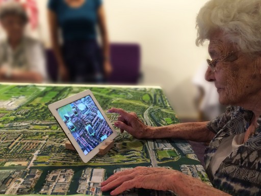
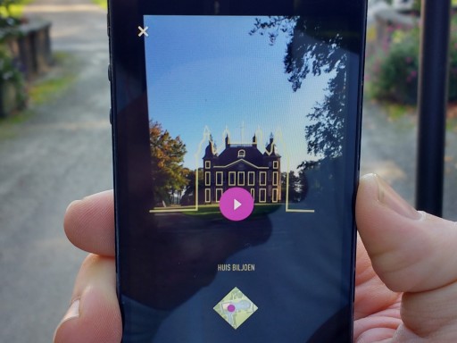
In these cheerfully sunny weeks, the studio has found a nice daily routine in our current work. Wouter and Pieter spent most mornings putting the final touches on Hoog+Diep 2020 strategy, either at the office or in meetings with industry veteran Ries Meertens. After a home made wraps or strawberries lunch, afternoons are taken up by new leads and formalising projects involving castles and coded spaces. Meanwhile Noortje is either exploring visual metaphors for her business-relationship management tool for graphic designers and their clients or testing the results in the field. At the end of the day her desk is often overflowing with research material, quick sketches and rough paper cut outs of rivers, crocodiles and the like…
Customer journey demos
Tjeerd and Mattijs meanwhile spent most of their time creating a super clear monitoring tool for financial service providers as part of our customer journey demos. As the wonderful Bret Victor that this interface for learning is first and foremost an information graphic design challenge: The main aim is to find out what questions the user wants to answer and create an interface that presents the information in the best possible way to help her do this quickly. For this tool user questions like “what is our risk and how did evolve over time and place?” guided us to create a design that answers these questions quickly even without the user touching the interface.

Testing our work in progress on the monitoring tool
The interaction allows the user to zoom in and out of the important details of the larger story. If a sudden rise in risk occurs for instance, the user can pick it apart based on location, time and type of risk.
Android Wear and other dumb extensions to smart phones
Keeping up with the latest smart watch developments we briefly dove into the Android Wear SDK preview, Google’s first step towards full smart watches support. The most important aspect is that Google has chosen to create a card based UX/UI model: (Google Now like) notifications are presented as a vertical list of cards the user swipes through. Swiping to the left shows additional information and buttons of the card.

Android Wear’s card based UX/UI model
The choice for this restricted UX/UI model has pros and cons when creating a smart watch touchpoint for your service. The obvious advantage is that it takes very little development effort to create an Android Wear card. Your Android smart phone app just needs to tell the card what notifications and background images to show and if needed which buttons to provide. This can be done quickly and does not require to develop (and maintain!) a separate application for the watch. Approaching devices as dumb extension of a smart phone like this, is part of a bigger trend which includes Apple Carplay, Windows for cars, but also external sensors.

Apple Carplay as an example of ‘dumb’ extensions to ‘smart’ phones
The downside to this restricted model is that it is currently very limited in what you can do within the cards and that you are not allowed to create a custom user experience. Depending on what you want your smart watch “application” to do, this could mean you can not provide the functionality your service is known for. Take our Next Train app for example. It is impossible to reproduce its current experience with Android Wear and we are unsure if the service holds up if we “port” it to the card model. We are currently exploring this in first sketches..
Tweakers.net review of Pebble Steel and Next Train
In the mean time Dutch tech site tweakers.net used NextTrain to review the new Pebble steel watches..
Besides getting current work done and enjoying the sunshine, Mattijs visited the combined Pro Light & Sound and Musikmesse, Pieter the Independent Magazine Biennale Facing Pages (to perform with his band WLDRF) and Tjeerd created the online travel log for Aafke’s wonderful art-road-trip Walk of art.